work
Rebranding a pioneer in PC gaming.
The challenge
For more than 20 years, NZXT redefined what a PC Gaming setup should look like. The company methodically moved the market towards a design aesthetic where gamers were proud to display their rigs for all to see. But in that time, their brand and visual identity had gotten stale, getting lost in a sea of minimalism that had spread through the industry. With a new industrial design language rolling out to market, they came to Robin to rethink their brand positioning and visuals.
The solution
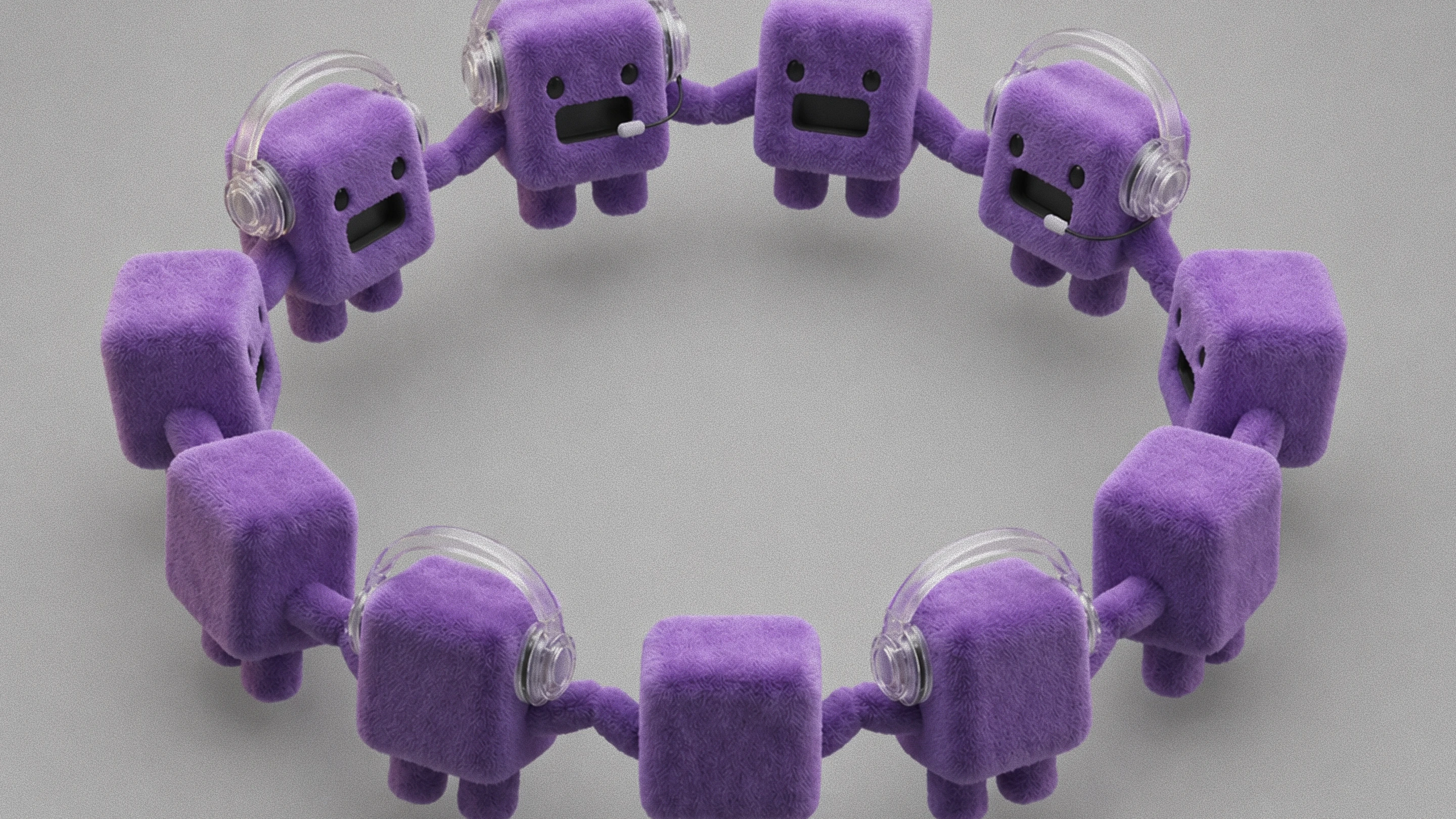
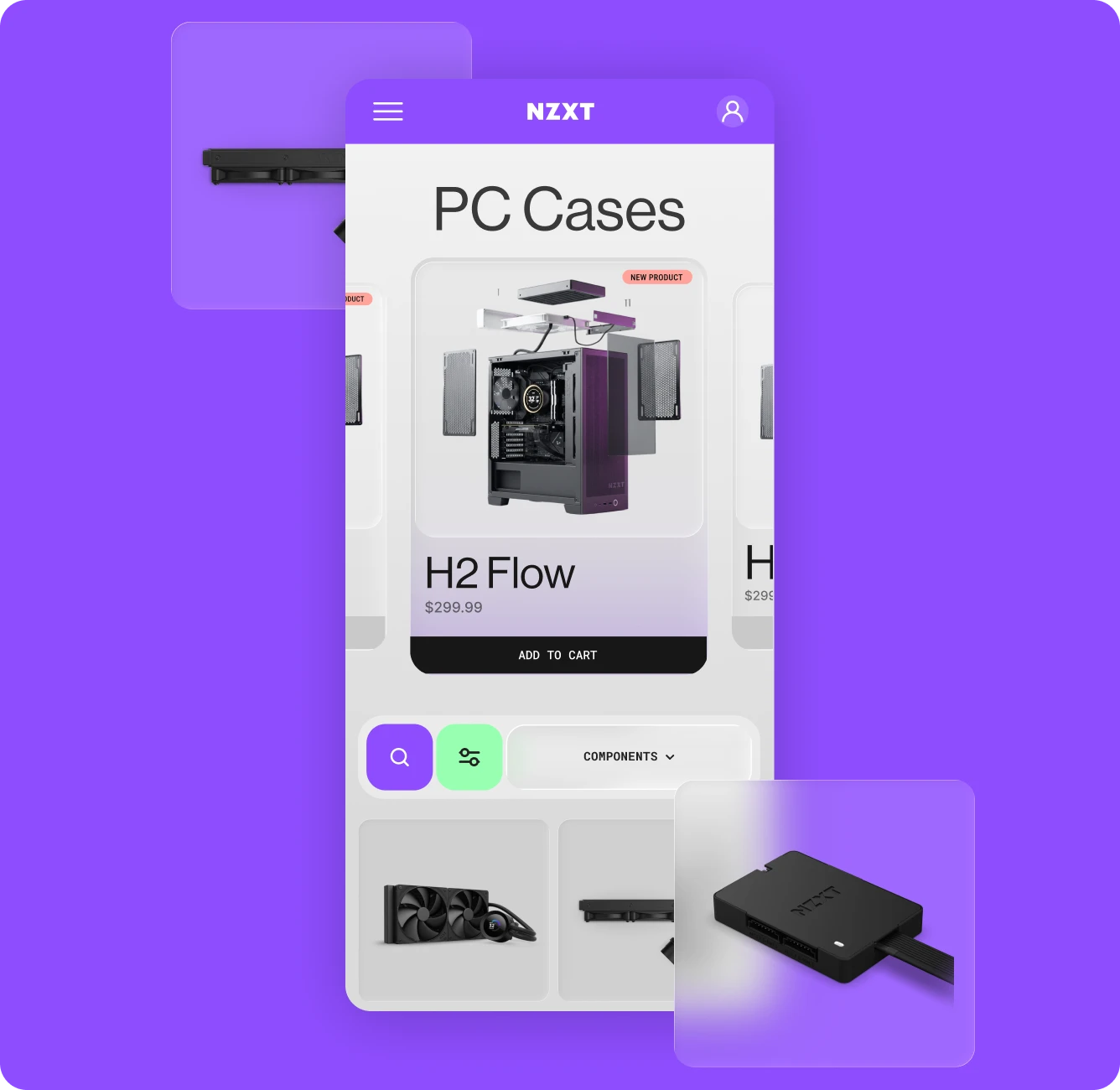
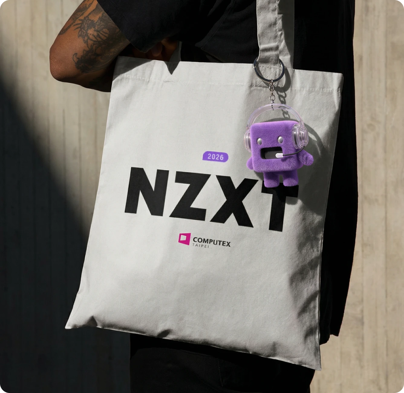
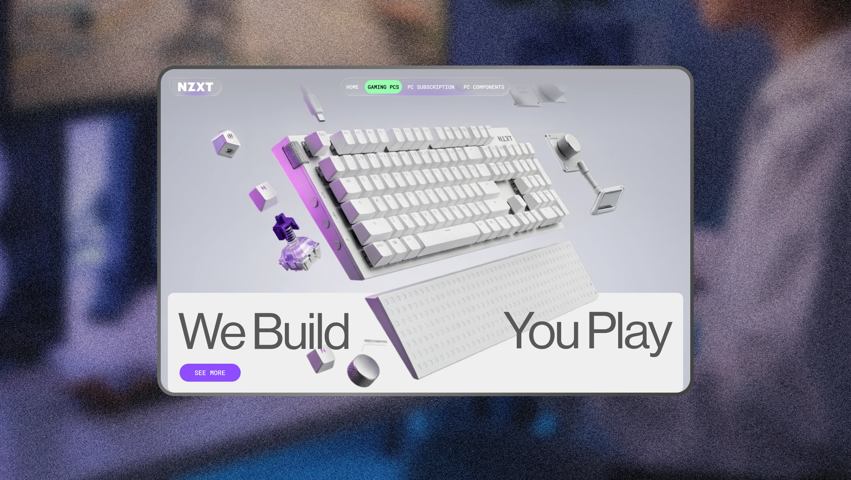
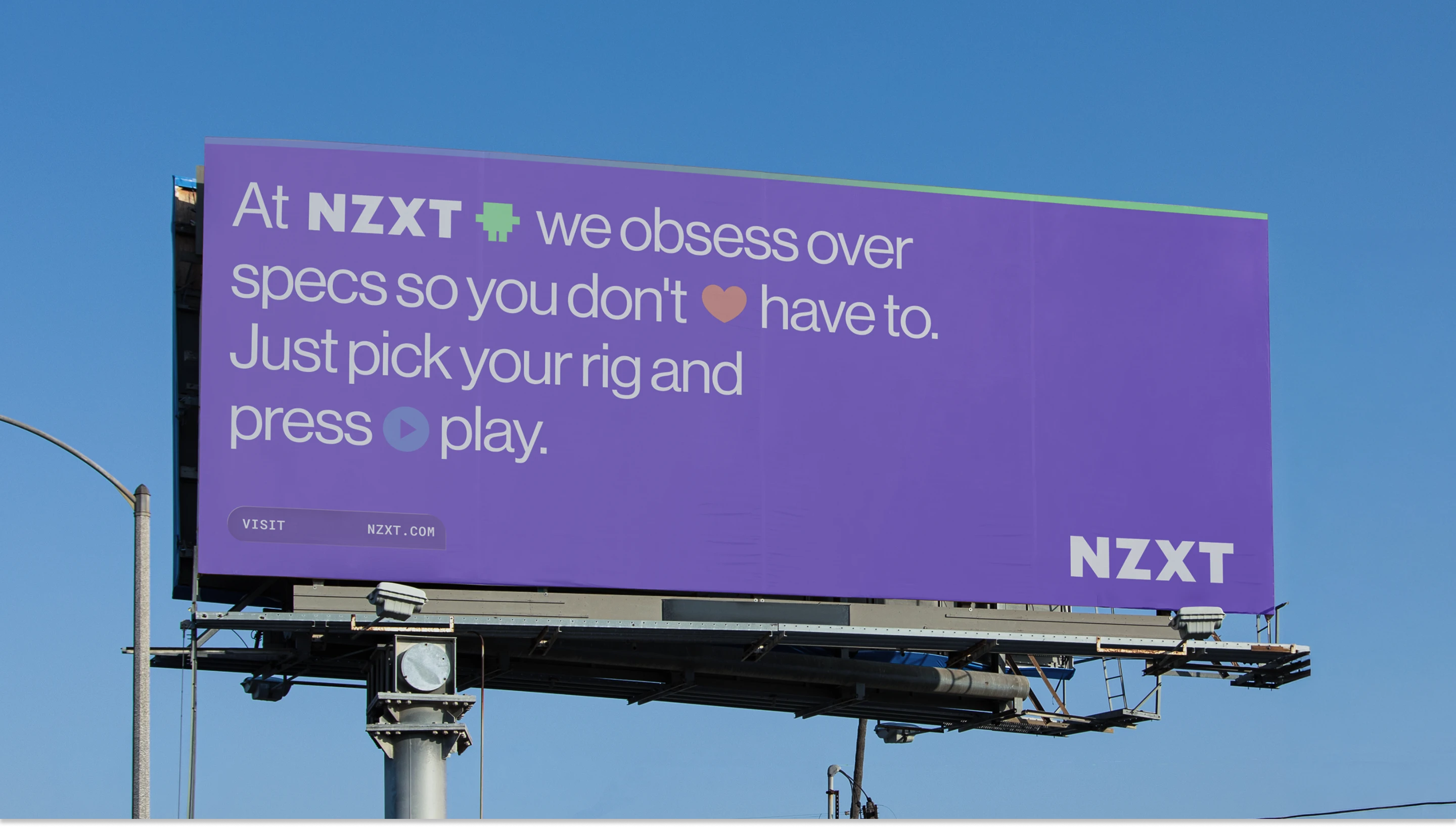
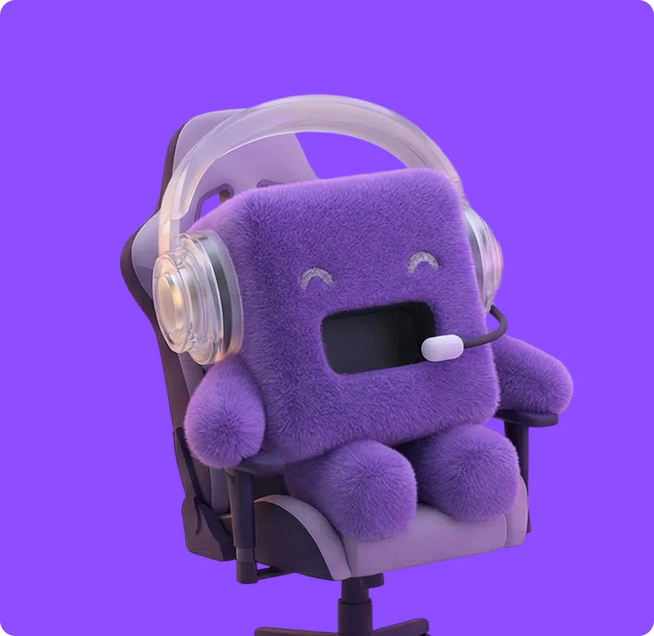
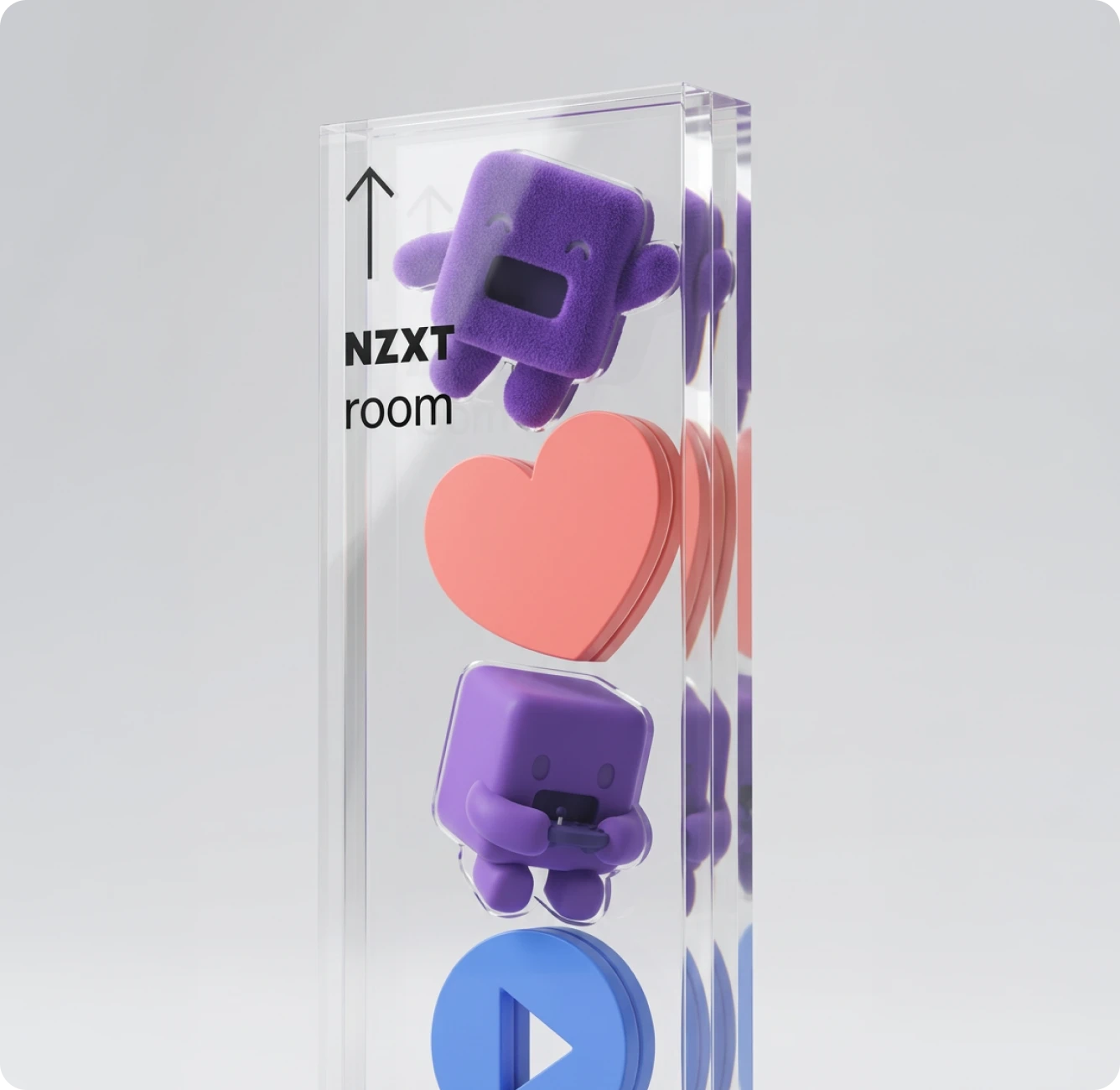
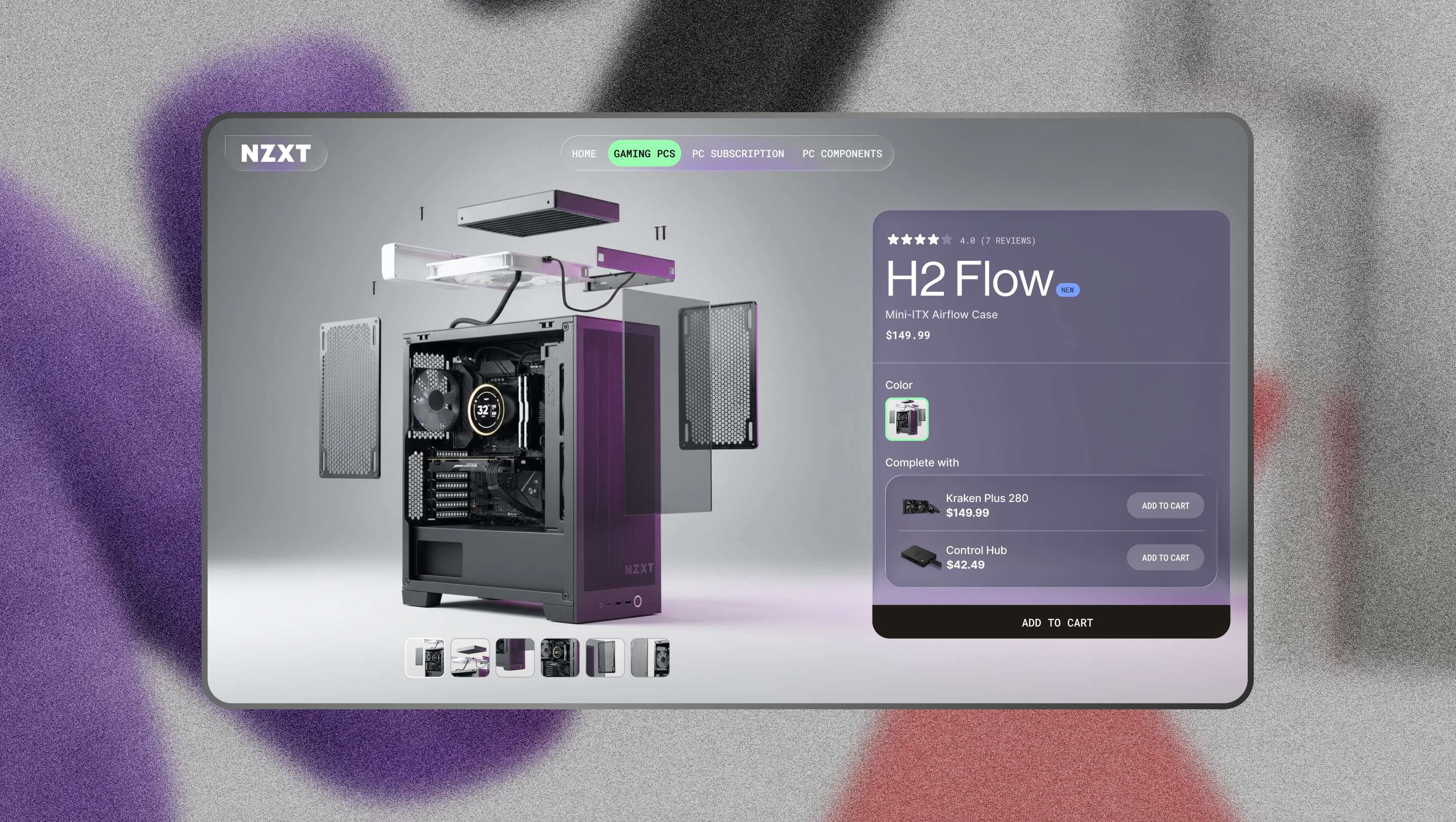
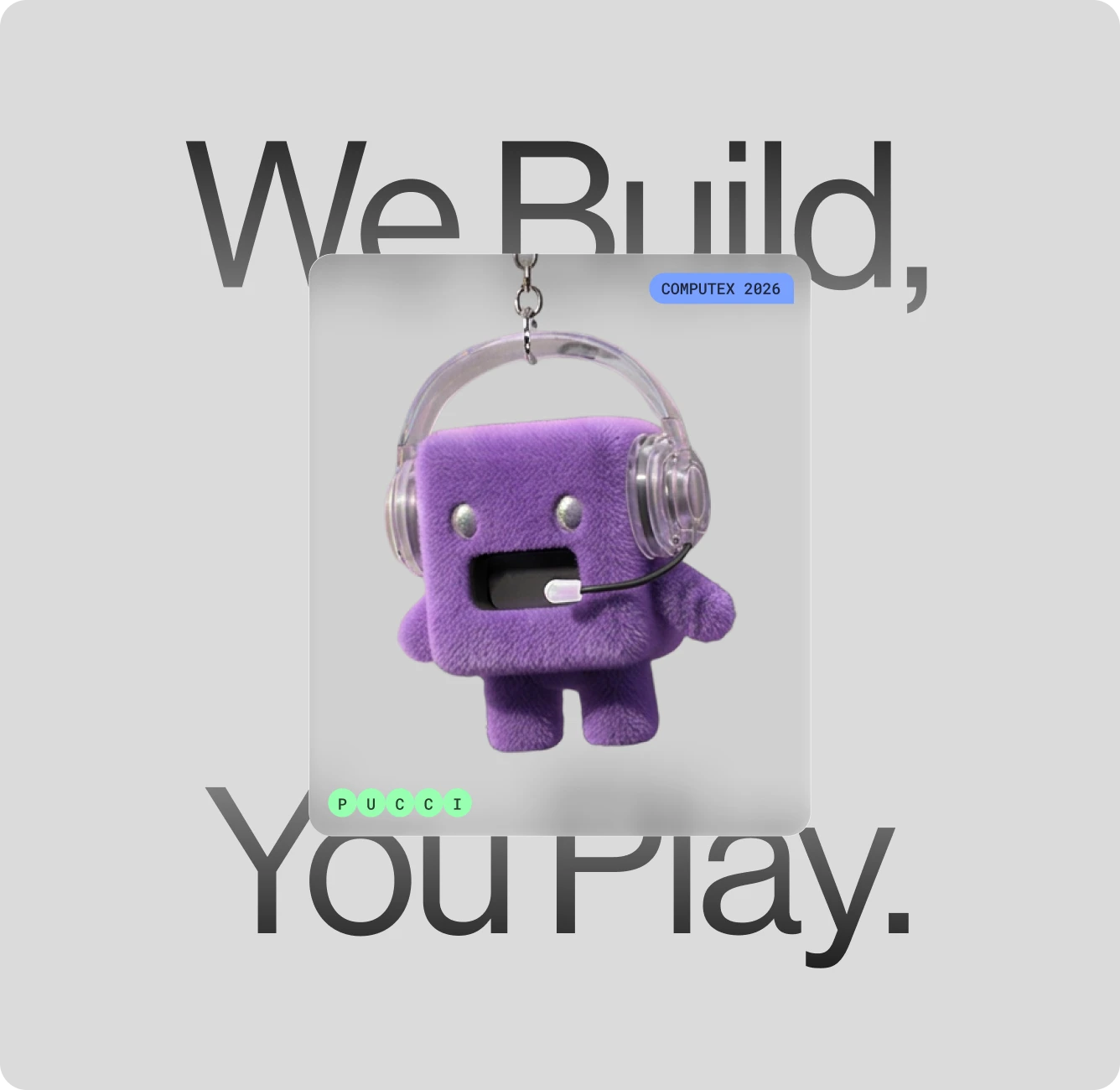
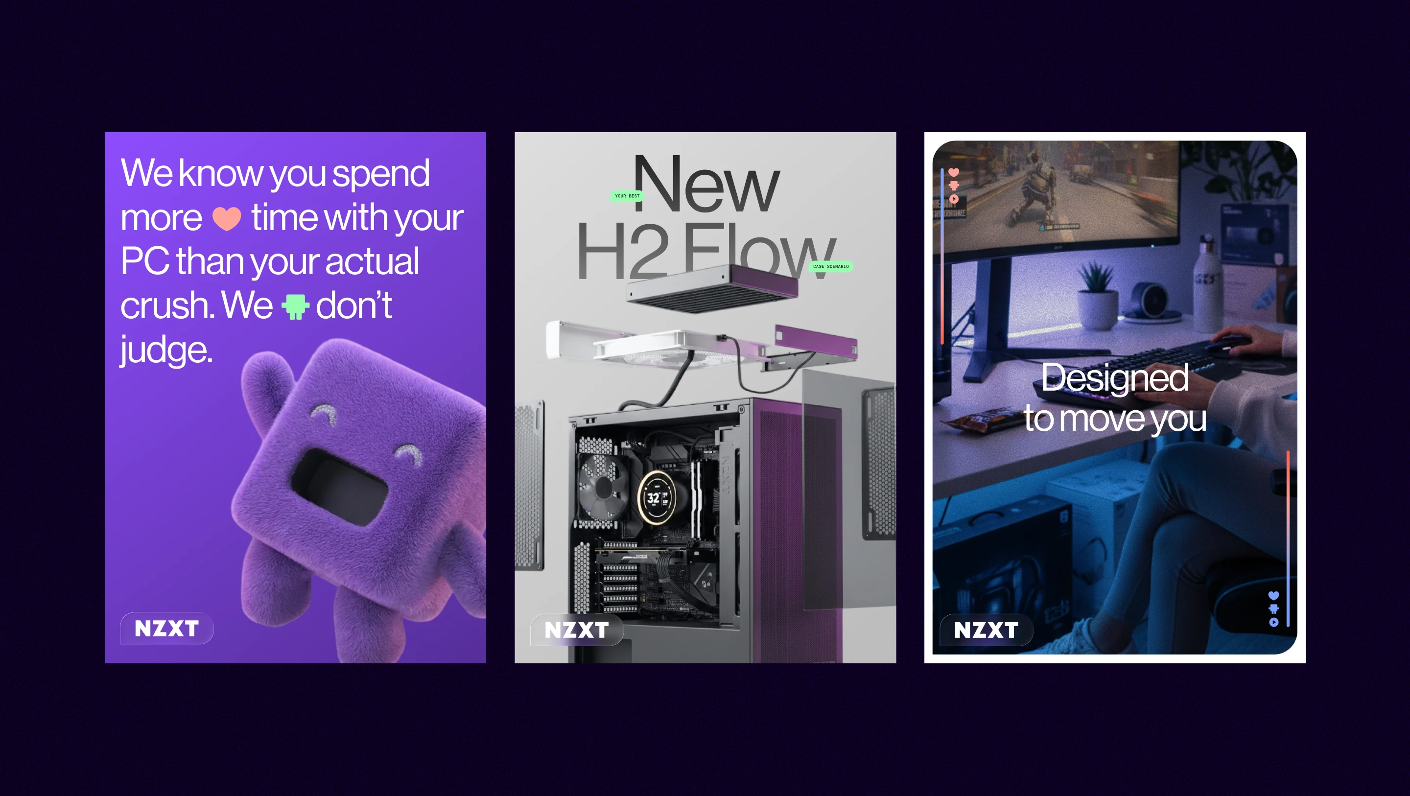
We did a thorough research phase, auditing the market, and interviewing customers and internal stakeholders to find the whitespace NZXT had the authority to own. And what we found was that while every other PC gaming brand out there was touting specs and their ability to help you crush your opponents, NZXT was offering something different: inclusivity, levity, and an ambition to help others experience the joy of PC gaming. We built on that joy, and created a call to action to anchor the brand around: Let’s play. Visuals dropped out of this new brand position, with their formerly-behind-the-scenes mascot Pucci pulled to the forefront with a new, plush makeover. Clean sans serifs, a refreshed palette, and updated hardware renders come together for a more modern look and feel that compliments their updated design language.
Results
The new playful NZXT debuted at Computex in Taipei, and will continue to roll out across brand touchpoints through the rest of 2026 and early 2027.
Want to get a better idea of our work and find ways to collaborate?
Get in contact with us to talk through what you’re looking for.