work
Crafting a brand for the New York Mets.
The challenge
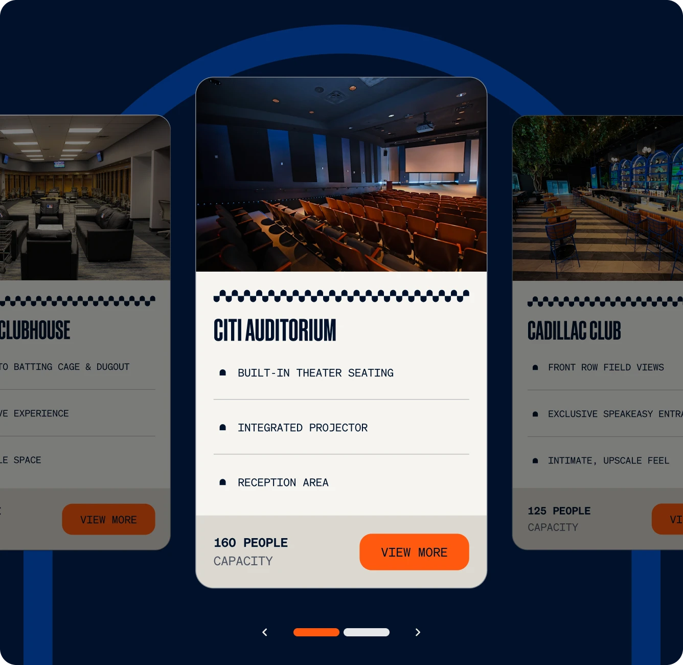
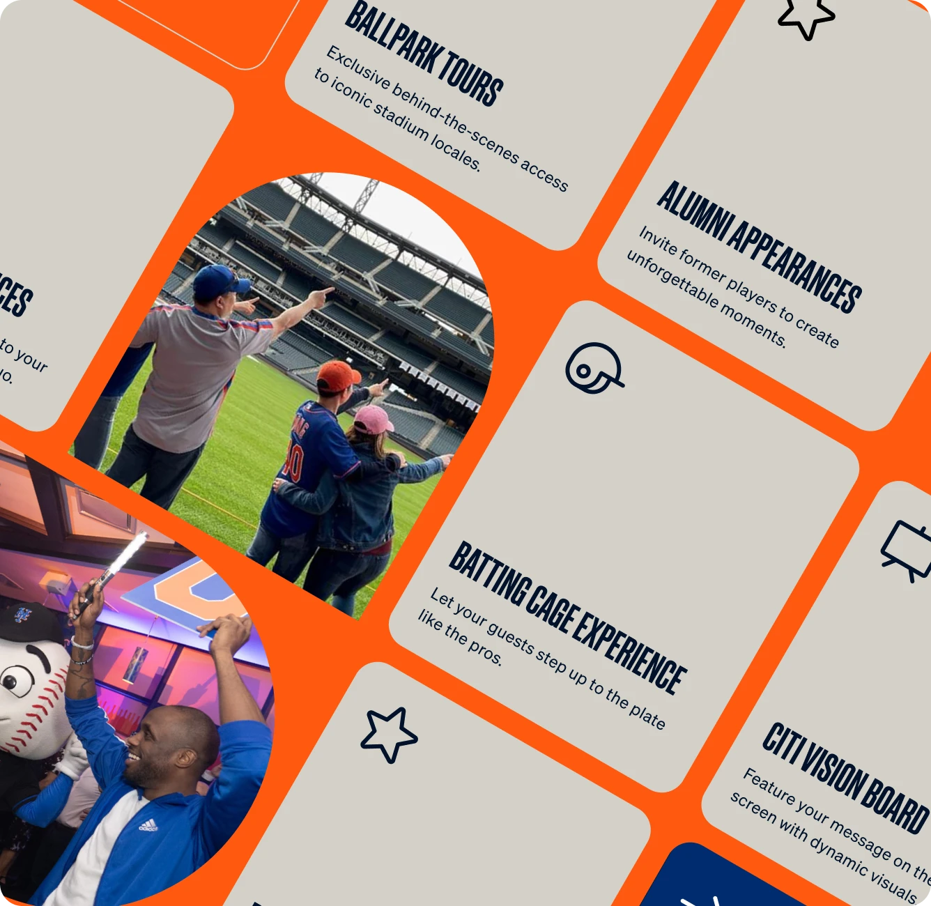
The Mets built a significant complimentary business line outside of the on-the-field product, turning Citi Field into a home for so much more than baseball. From Mitzvahs to MLS games, the building was welcoming a whole different audience to the world’s borough. With a then potential — and now definitive — expansion of the arm’s mandate to scale to the surrounding neighborhood, the organization needed a brand that would allow them to capture business beyond the ballpark.
The solution
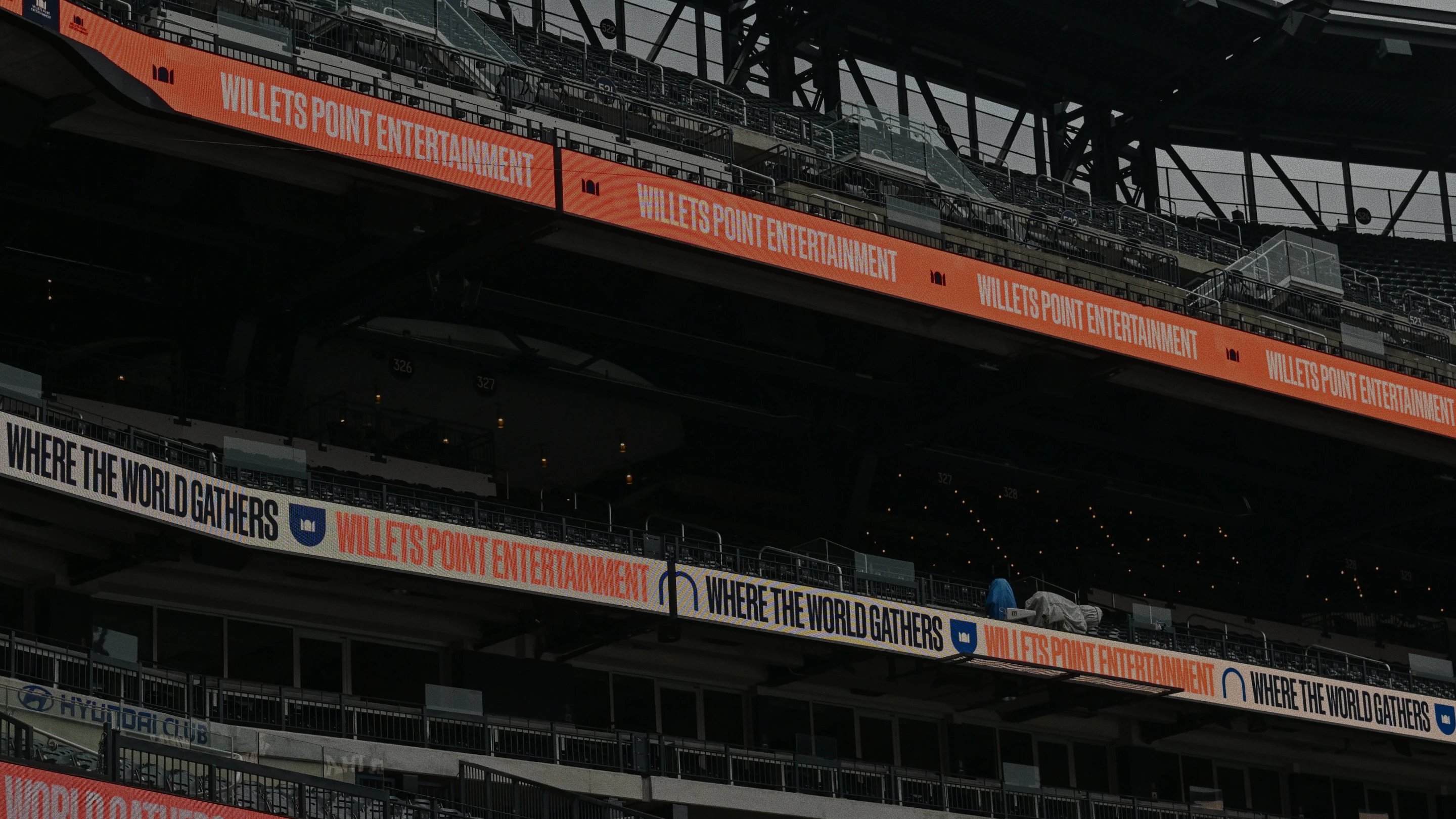
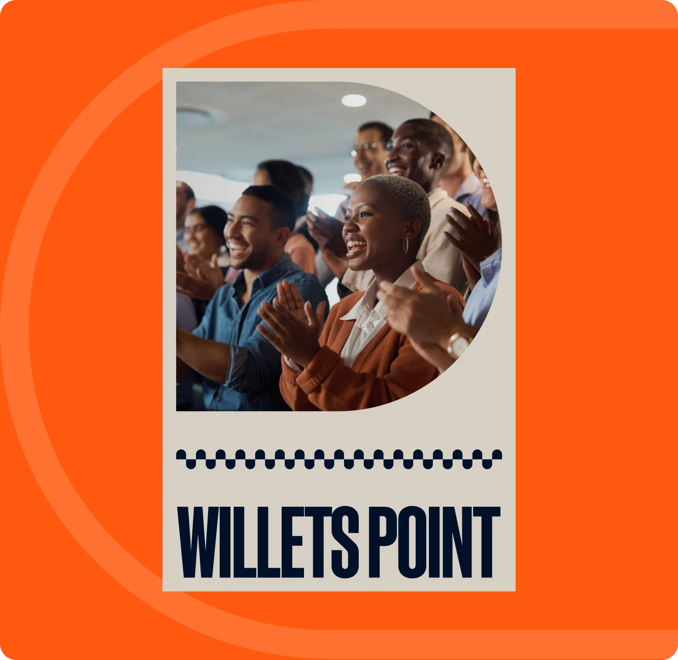
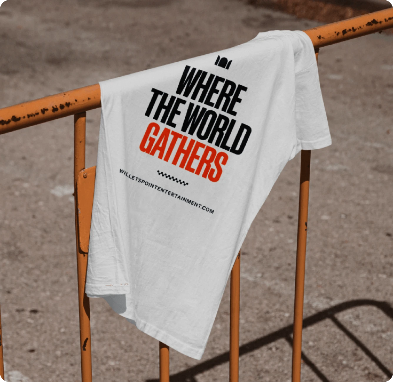
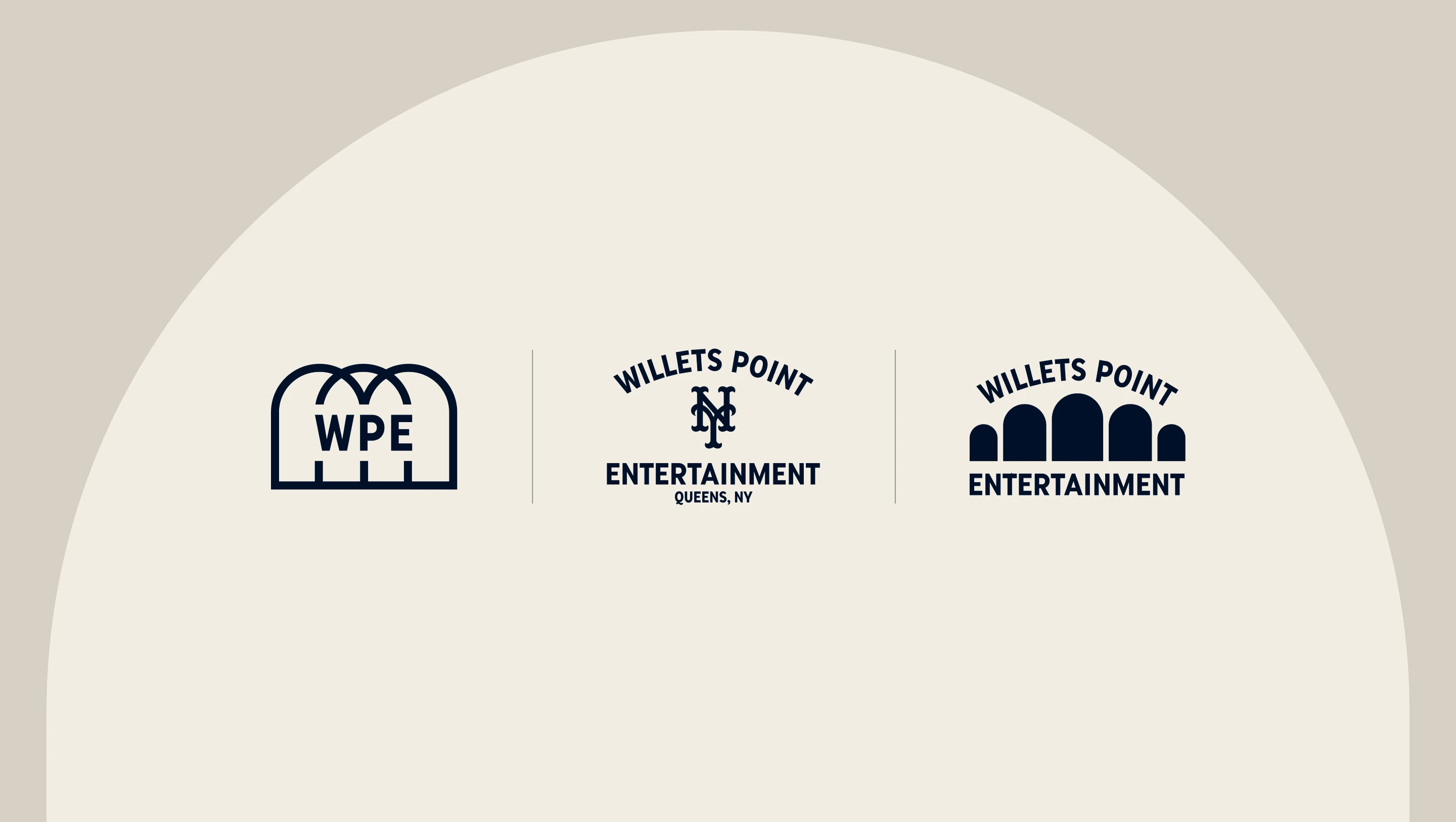
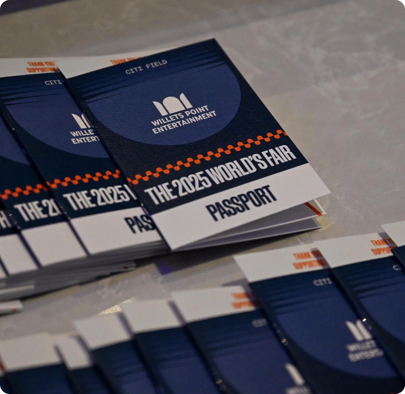
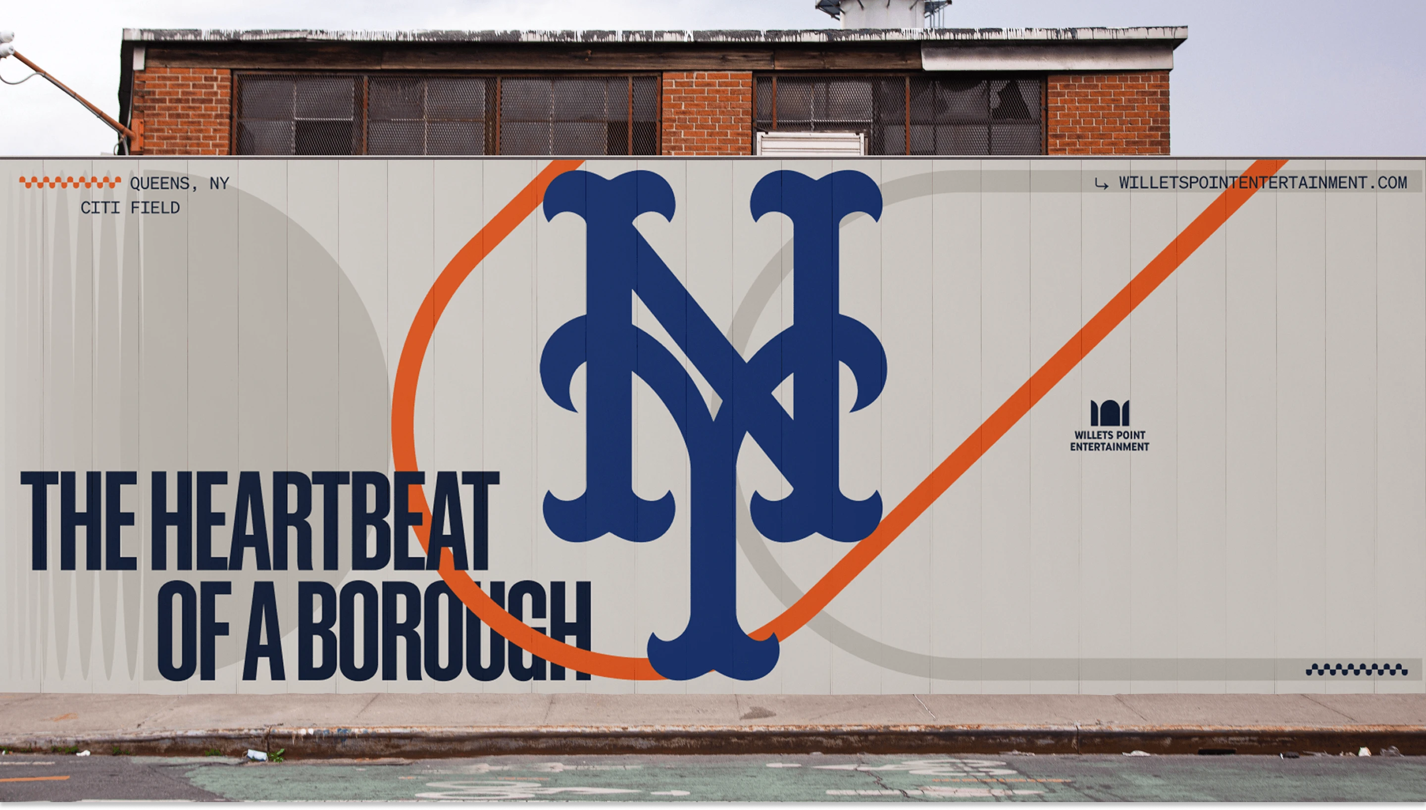
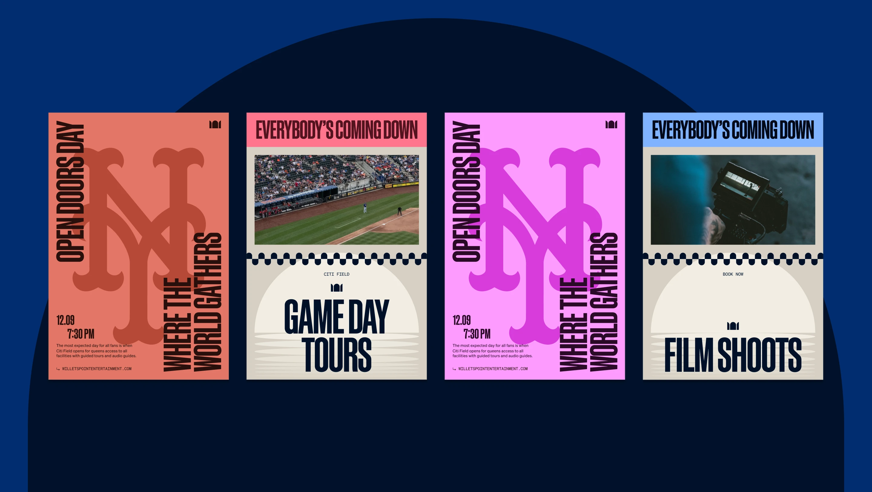
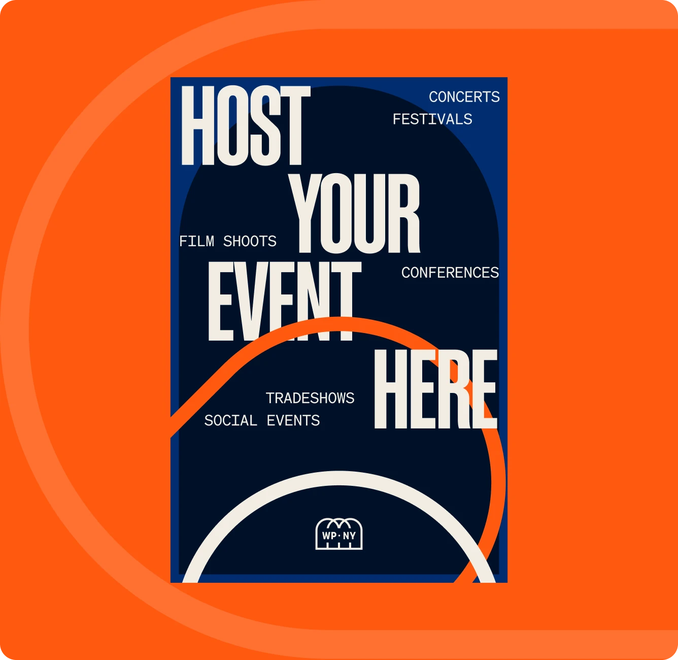
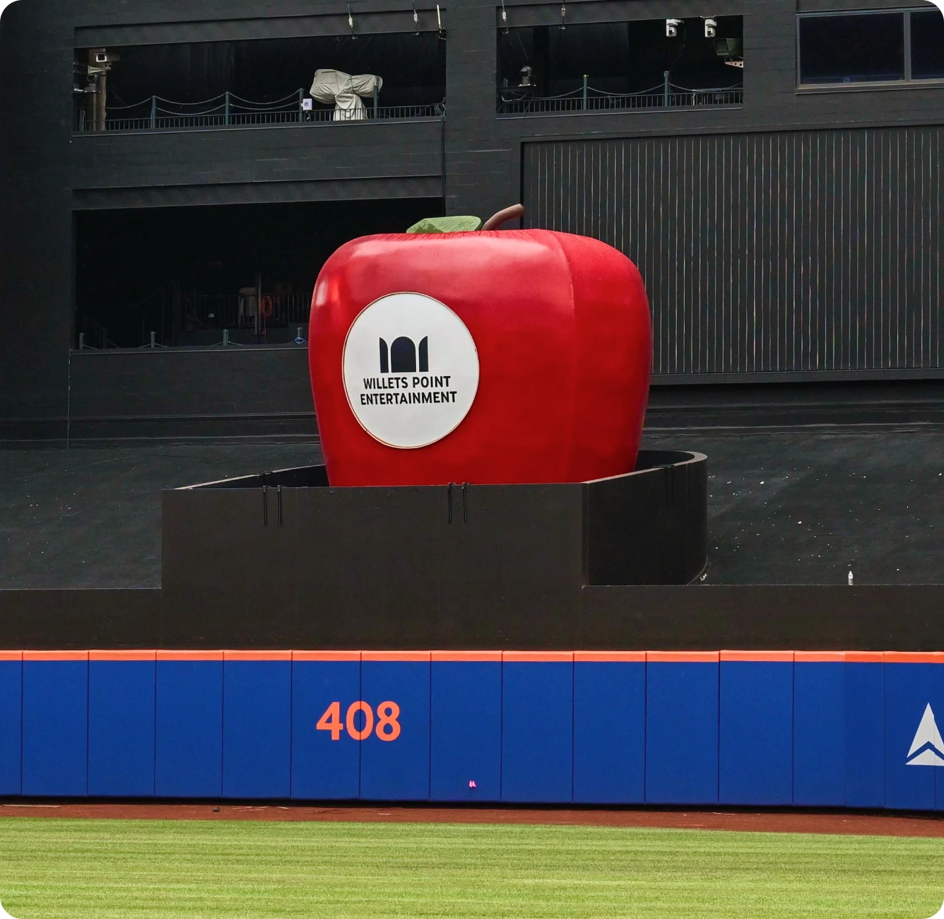
It all started with the name, and following a thorough process, we selected Willets Point — the neighborhood home to CitiField, and whose moniker marks the iconic subway signage when you pull into the station. Inspired by the distinctive windows that adorn Citi Field's exterior, the arch served as the visual cornerstone of the brand, honoring the physical space where the Willets Point story began. The geometry offers remarkable versatility and scalability. When multiplied and arranged, it turns into powerful secondary iconography: a crown symbolizing Queens' cultural prominence, a series of subway cars representing connectivity, or the beloved Jackie Robinson Rotunda that stands as a testament to history and inclusion. Kinetic typographic treatments pair with a twist and expansion of the Mets color palette, to create a brand that channels the energy of the borough and welcomes it home.
Results
The brand launched in 2025 to much acclaim, and we continue to work with the Mets and Willets Point today on brand marketing and design initiatives across the organization.
Want to get a better idea of our work and find ways to collaborate?
Get in contact with us to talk through what you’re looking for.